Microsoft Surface Duo is not like other foldable smartphones. It does not use a flexible screen, but instead offers to divide your attention between a couple of regular ones. When opened, there is a minimal distance between them, so the gadget is definitely impressive as an engineering solution. However, the actual use scenarios for this gadget are questionable.
The best Telegram channel about technology (possibly)
Has Microsoft really managed to create a truly smart smartphone almost four years after the death of Windows Phone? To answer this question, the device was tested for 12 days. At this time, the gadget was running Android 10, running an operating system with build number 2020.812.86. The device received a software update to improve stability a week after testing began.
Characteristics
- each display: 5.6-inch AMOLED, 1800x1350, 4:3 aspect ratio, 401 PPI density;
- two screens: 8.1-inch AMOLED, 2700×1800, aspect ratio 3 to 2, density 401 PPI;
- chipset: Qualcomm Snapdragon 855;
- RAM: 6 GB;
- storage: 128 GB or 256 GB;
- battery: 3577 mAh, charging 18 W;
- camera: 11 MP, ƒ/2.0; 84 degree viewing angle, HDR, [email protected] or [email protected] ;
- Dimensions and weight: 145.2×186.9×4.8 mm open, 145.2×93.3×9.9 mm closed, 250 g.
Surface Neo
The most interesting device of the environment was presented last. This is Surface Neo. Previously it was known under the code name Centaurus. This is a flexible Microsoft device with two screens. It was not shown on stage for long; there is no detailed information yet. This is just a hint of what major innovations can be expected in the personal computer market.
The thickness of the device is 5.6 mm. Microsoft claims it has managed to fit the thinnest LCD panels into a computing device. It uses 360-degree hinges, allowing two 9-inch screens to rotate relative to each other. The new Surface Slim Pen magnetically attaches to the back of the case and recharges.
If you want to type, there's a magnetically attached keyboard. It can be turned to the back of the device at any time. It uses an Intel Lakefield processor with a custom graphics engine. This allowed the developers to make the device thin and light.
Surface Neo has the traditional sleek design of the Surface line. This form factor seems to be able to make good use of two screens, working more like a magazine than a computer.
A special edition of the operating system called Windows 10X is used here. It is designed specifically for flexible computers, which may begin to go on sale towards the end of 2020. Then other manufacturers, such as Dell, HP, Lenovo, will catch up.
Design
The Microsoft Surface Duo resembles a small notepad or passport. When closed, it is slightly thicker than the Samsung Galaxy Note 20 Ultra - 9.9 mm versus 8.1 mm, excluding the protruding camera. When open, the thickness of the gadget is 4.8 mm - it is almost halved. It's not much larger than the USB-C port that's used for charging.
The design of the gadget is surprising: Microsoft obviously wanted it to be the size of a regular smartphone when closed. Other foldable smartphones tend to be criticized for being thick, but the Surface Duo stands out from them in this regard.
There is no screen on the white surface of the Surface Duo, which is covered with protective Gorilla Glass; there is only room for the Microsoft logo. The edging of the device is covered with ceramics and has a soft rubberized coating. During use, the smartphone has noticeably worn out, so it can hardly be called practical. On the bottom of the gadget, under the right screen, there is a USB-C port; on its right edge there is a fingerprint scanner, a power button and a volume rocker.
The device has two 5.6-inch AMOLED displays, which are surrounded by a massive frame. The right half houses the speaker, camera, flash and ambient light sensor. On the left there is another light sensor and an additional speaker.
The hinge is the most interesting part of the Surface Duo. It makes it possible to rotate the halves 360 degrees and use the device in different scenarios: one screen, laptop and tent. To achieve this, Microsoft reduced the diameter of the connecting wires to the thickness of a human hair. Despite this, the design works surprisingly well.
The Surface Duo looks great, but it immediately makes it clear that this is only the first generation and requires improvement. This is hinted at by the small number of cameras and large frames around a pair of screens.
Comparison of iPad Pro 2020 and Microsoft Surface Pro 7
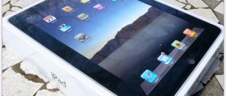
The iPad Pro is positioned by Apple as a tablet that is quite capable of replacing a laptop in terms of its power. The external Magic Keyboard is used specifically for this, and the promotional campaign strongly emphasizes the broad capabilities of the iPad Pro.
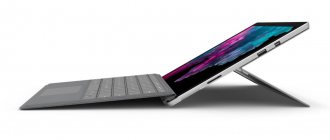
The Microsoft Surface Pro is in many ways similar to the iPad, but it is a full-fledged PC replacement; it can even be called a transformable laptop.
At first glance, the iPad Pro seems like the best tablet on the market. Numerous features, especially appreciated by artists and designers, plus the power of the tablet, beg the question - can the iPad Pro compete with laptops? That's what we plan to find out by taking a look at the new iPad Pro 2020 and comparing it to the Microsoft Surface Pro 7. Both devices are modern, powerful, and aimed at doing the same things.
Design has always been Apple's strong point, and even without looking closely, you can immediately give a verdict - the appearance of the Apple iPad Pro is much more attractive than the Surface design. The more advanced screen and processor are also thought-provoking, and even the keyboard stand is a few steps ahead.
But design and even power are not everything. So we'll take a closer look.
Source: MobileSyrup
Characteristics
iPad Pro came in two versions: 11 inches and 12.9 inches with screen resolutions of 2388x1668 and 2732x2048, respectively. The Surface Pro 7 has a 12.3-inch screen with a resolution of 2766 x 1824. It would be surprising if the iPad was inferior to its competitor in terms of screen characteristics, so in this case the result was not at all surprising.
According to the manufacturer, the battery of both iPad models can withstand up to 10 hours of operation, or rather web surfing. Surface, according to tests, works for about 8 hours.
The A12Z Bionic processor powers iPad, and Surface harnesses the power of 10th Gen Intel Core i3, i5, and i7 processors.
iPad options are limited to internal memory of 128 GB - 1 TB, depending on the specific model. Surface supports the same options on SSD storage.
As for the possibilities of transformation into a laptop, for Apple this function is performed by the Magic Keyboard or the Folio smart case. Microsoft Type Cover Keyboard turns Surface into a full-fledged laptop.
If you plan to draw or use touchscreen features, you don't have to rely solely on your fingers; the 2nd generation Apple Pencil supports iPad and Surface Pen, Microsoft's tablet.
And of course, the weight of the device plays a significant role. The youngest Apple model weighs 450 g, the older one weighs 630 g, and the Surface becomes the heaviest, weighing 720 g.
Source: CNet
Performance
Apple doesn't skimp on its promises when it comes to its new tablet. The company claims that the iPad can outperform most Windows laptops. Moreover, in 2018, when the first iPad Pro was released, this statement was not at all empty. Now it is difficult to confirm this statement with certainty, since, according to performance tests, some laptops are still more powerful.
The “new” A12Z processor is the same familiar A12X processor and the only difference is the additional activated GPU core. Therefore, the frequency does not change, it remains 2.48 GHz, as in the 2020 model. The tablet received more RAM, 6 GB instead of 4 GB, but the speed does not increase by much. Thus, according to the results of Geekbench tests, the iPad Pro 2020 received a result of 1117 on one core and 4724 on several.
The difference in performance may not affect the user experience and will not even be noticeable to most users, but this is where Surface unexpectedly shows itself. Thanks to the quad-core Intel Core i7-1065G7 processor, Geekbench 5.0 tests showed a result of 1235 on one core and 4848 on multiple cores. The top version of the Surface Pro 7, which hit the shelves in 2020, turns out to be faster than the iPad Pro 2020. In its favor is 16 GB of RAM, which also affects performance. And the RAM at work will already become noticeable. Compared to its peers, including the iPad Pro, the top-end version of the Surface definitely wins.
However, there are two more points worth noting. The graphics on the 2020 iPad Pro have received fantastic reviews, with many even comparing them to the video on the Xbox One S. If you're not sure what that means, we'll explain: the iPad outperforms almost every Windows laptop when it comes to video performance. The Surface Pro 6 was left behind, and even Ryzen laptops with Vega graphics couldn't match the iPad's performance. We expect no less results from the iPad Pro 2020 and, although this will require further testing, we have no reason to doubt Apple. There's every reason to believe that the 2020 model will be able to outperform the 10th-generation Intel Iris Plus that powers the Surface.
The second point is that benchmark tests do not always represent performance realistically. The values are accurate, but the sensations and problems that lie in wait for operating systems can tip the scales.
Source: Techievik
Display
The iPad Pro received the same display that was equipped with the 2018 model. As before, this is an IPS panel and, in principle, the same technology is used on the Surface Pro 7.
The 12.9-inch model has a screen resolution of 2732 x 2048 and an image depth of 264 pixels per inch.
The 12.3-inch Surface, in turn, received a resolution of 2736x1824 and 267 pixels per inch.
The 2020 iPad Pro had a brightness rating of 484 nits, while the Surface Pro 7 had a brightness rating of 395 nits. However, Apple insisted that the 2018 iPad achieved 600 nits of brightness. Exactly the same characteristic is attributed to the iPad 2020. If the screen remains completely the same, there is reason to believe that the brightness will remain unchanged. This is in any case higher than the Surface, so in this regard Apple is ahead of its competitor.
The iPad Pro 2020 also offers a higher screen refresh rate - 120Hz versus 60Hz on the Surface Pro. Both the release date and trends played a role here. Of course, we must not forget that high frequency wastes battery power much faster, so further tests will be required in order to determine exactly.
Source: Digital Trends
Design
One look at both devices is enough to determine the winner of this round. Despite the fact that the external characteristics of the model have been preserved from 2020, Apple is simply using a more impressive form factor and style. Symmetrical and minimalistic, it looks expensive. The Microsoft Surface Pro 7 isn't gaudy, it looks neat and nice, but it just lacks modernity. In this regard, of course, there was no doubt.
The dimensions also speak in favor of Apple - the devices are simply smaller and lighter, which makes them more convenient.
Cameras
The 2020 iPad Pro cameras have received a significant upgrade over the 2020 version. On the back of the body there are now two 12 megapixel cameras with wide-angle and ultra-wide-angle lenses. There is also a flash nearby. The cameras also work using new technology - the LiDar sensor, which is considered the key to the creation of Apple Glasses.
LiDar is a camera system with a laser, the laser is directed along a specific path indoors or outdoors, and the camera measures the distance traveled by each photon to create a 3D map of the environment. This happens 120 times per second.
This sensor allows iPad Pro to integrate virtual and physical reality, allowing for an enhanced AR experience. On the front, the tablet received a True Depth camera for biometric recognition and a 7 MP selfie camera for photos and FaceTime.
The Surface Pro has a much simpler camera - it has a 5 megapixel front camera and an 8 megapixel main camera, there’s not really any competition here, since Apple easily wins.
Source: AndroidPIT
Keyboard
The Surface Pro 7 has a Type Cover, which is a great keyboard. Microsoft has been systematically refining it and spent more time on it than Apple did in 2020. The keyboard is sold separately and costs $100 less than the Smart Keyboard 2020 for iPad. The 2020 model is even more expensive, and for good reason—the keyboard has been redesigned for better performance. Despite the price, Apple's design looks more impressive, and ergonomics also speak in its favor. It feels like it works the same as on new MacBook models and this is a definite plus. Both keyboards are quite comfortable and there are no major complaints about them, but the price of the Type Cover definitely puts it ahead.
Stylus
The long-running battle between the Surface Pen and the Apple Pencil doesn't get any easier in 2020. Both devices are equally sensitive to pressure and efficient in operation. The price difference isn't too big, but Apple offers a magnetic mount with charging, and this feature is quite convenient for those who often work with a stylus. Plus, everything else about the iPad is heavily graphics-focused, so overall the results are more noticeable.
The Surface Pen is also convenient, and is not much inferior to the alternative.
Ports
Apple has never been known for caring about wired connections, so the Surface Pro is the clear winner here. The iPad received only one USB Type-C port, and the Surface Pro 7 received the ability to connect to external screens, chargers, etc. The tablet has a USB-C port, USB-D, Surface Connect, a MicroSDXC card reader, and a headphone jack, which the iPad Pro doesn't have.
All this allows Surface to work with two 4K displays simultaneously.
The iPad Pro can work wirelessly thanks to the sidecar feature, but this is only possible with Apple computers.
Battery
The iPad Pro 2020 processor is designed to save battery power, unlike the 10th generation Intel Core i7 processors. The iPad Pro has already set the pace with 13 hours and 14 minutes, and the 2020 model is likely to achieve a similar or better result, which would fit with Apple's style and desire to improve performance with each new model.
Surface copes worse in this regard; the result of 7-8 hours is not able to satisfy most users, and these are indicators under average loads, that is, when watching a movie or playing games, the battery will run out much faster.
Source: Digital Arts
operating system
As for the operating system, a lot depends on what exactly you are used to, but this can also make you prefer one of the two devices.
Some specialties require a specific set of applications, most of them will be available on Windows, but not all are ported to iPadOS. The Surface Pro is capable of running any and all programs created for Windows OS; the iPad Pro does not have this ability, even when it comes to MacOS. For photographers, videographers or musicians, the apps available for iPadOS simply won't be enough, despite Apple's assurances. For example, the iPad does not support all Adobe CS applications and this definitely affects its capabilities.
Therefore, you should choose software primarily based on your requirements.
Bottom line
Despite all the features and power of the 2020 iPad Pro, the Surface Pro 7 has a few significant advantages. One of them is the price, the other is the software. The iPad Pro is not yet ready to become a full-fledged laptop replacement, while the Surface is essentially a transforming laptop.
Nevertheless, the iPad Pro will easily find its circle of fans and will become an indispensable and convenient device for them. For those who write, sketch, and use a tablet to surf the web, the iPad Pro is a winner. For others, the Surface may be more suitable.
Performance
Microsoft Surface Duo is powered by the Snapdragon 855 chip, Qualcomm's flagship solution from early 2020. It is still quite productive, but the new product based on it often works quite slowly - it freezes and slows down every now and then. Apparently, this is due to insufficient software optimization. However, doubts also arise about 6 GB of RAM, which is still not enough today.
After the update the device received, it began to work faster and more stable. However, freezes remained even after this.
In AnTuTu, the Surface Duo scores 412,006 points - the OnePlus 7 Pro with similar characteristics is inferior to it with a score of 361,038 points. In two 3DMark tests, the new product scores 5,517 and 5,032 points versus 5,412 and 4,814 points for the OnePlus 7 Pro. In Geekbench, the gadget shows 3,491 and 10,393 points in single-core and multi-core tests, respectively, against 3,411 and 10,628 points for OnePlus 7 Pro.
Despite decent benchmark scores, Microsoft needs to work hard to make the Surface Duo perform decently in real life. Today its use does not evoke positive emotions. Initially, the manufacturer planned to launch the gadget at the end of 2020 - given the problems with the software, it is unclear why he started selling it in the first half of September.
Design and appearance
From a design perspective, the Surface Pro X looks great. Compared to the old-fashioned Surface Pro 7, this model is pure eye candy. The minimal bezel size is more reminiscent of the 12.9-inch iPad Pro than the Surface line. This device is also incredibly thin at just 5.3mm and weighs around 0.76kg. The case has a built-in stand that allows you to give the device almost any position - Pro X can be tilted up to 15 degrees.
Despite its lightness, this transformer seems very durable, looks stylish and is much closer in appearance to the premium segment than the Intel-powered Pro 7 processor. Surprisingly, with such a thickness, the Microsoft Surface Pro X has quite a lot of connectors.
There are two USB-C on the sides and a proprietary Microsoft charger slot, as well as SIM and microSD card slots on the back of the stand. You can charge the Pro X via USB-C or a dedicated port from Microsoft. Unfortunately, there is no headphone jack here.
Screens
Microsoft has always been known for its unique aspect ratios in its gadgets, and the Surface Duo is no exception. In single-screen mode, the 5.6-inch display has a 4:3 aspect ratio—a far cry from competitors, which often use 19:9 and 21:9. That's why Panos Panay, Microsoft's chief product officer, doesn't call the Surface Duo smartphone. He insists it's a Surface. To make it easier, it can be considered a PDA.
When the Surface Duo is open, its pair of screens have a 3-to-2 aspect ratio, the same aspect ratio typically used on laptops, including the Surface Book line. It's great for working with multiple documents at once, which is likely why Microsoft chose it. The company positions the gadget as a multifunctional tool for simultaneous work with several applications. There is a feeling that many will more often use the single-screen mode, which is more convenient for typing.
AMOLED screens look good: they operate at a frequency of 60 Hz, so they are not surprisingly smooth, but they have correct color reproduction.
Surface Duo supports pen input and works with all solutions designed for the Surface line. It's a pity that none of them are included in the delivery package of the new product - the box contains only the gadget, charger and bumper.
Communications and connections
One of the main advantages of the Pro X and most other Snapdragon PCs is gigabit LTE. The device supports 4G networks via a SIM card and provides high communication speeds in any conditions.
You can easily watch videos and surf the Internet even while traveling by train, without worrying about the quality of the connection. The Snapdragon X24 modem guarantees high data transfer speeds and that there will be no problems with the Internet.
Software
Surface Duo runs on Android 10 with Microsoft Launcher - it's available on Google Play, so anyone can try its single-screen version. However, the main feature of the new product is a pair of screens. They are supported by this shell, but not by alternative ones - for example, Nova does not work adequately.
Active Nova Launcher
Problems after uninstalling Nova Launcher
When a menu with all applications is open on one display, they are launched on the second. When you use the Dock, programs open on the screen they were launched from. You can easily drag windows between the halves of the device.
Some apps can also be used on two screens at once. For example, Microsoft Outlook shows the inbox on one and a preview on the second, and Amazon Kindle splits book pages between the halves.
Using two apps
Using one application in dual screen mode
Application does not work correctly in dual screen mode
It’s a pity that the list of applications adapted for two screens is extremely small - Microsoft has done almost everything, and other developers do not have the proper incentive to adapt their solutions. The manufacturer says that it worked on Surface Duo together with Google, but the company is in no hurry to adapt its programs for it - this, for example, applies to Gmail.
Apps optimized for Surface Duo:
- Adobe Acrobat Reader;
- Amazon Kindle;
- Jira Cloud;
- Microsoft Swiftkey;
- Microsoft Commands;
- Microsoft To Do;
- Microsoft Edge;
- Microsoft Launcher;
- Microsoft News;
- Microsoft Office;
- Microsoft OneDrive;
- Microsoft OneNote;
- Microsoft Outlook;
- Mylio;
- Spotify.
The Surface Duo has minimal extras at launch—it doesn't even have a screen recording feature. But there are plenty of problems: an active user will find new errors almost every day.
The background image has disappeared from the screen
Black screen instead of an open application
The app has disappeared from the Dock on the left
Constantly trying to launch the camera app
Many of the errors stem from the Surface Duo thinking it's a tablet. You can verify this from the screenshot - even if the second display is turned off, it still appears on it.
Android can scale apps dynamically, but Microsoft hijacks this ability to show them on a specific screen. Because of this, message bubbles from Facebook or Instagram stories do not work normally.
Of course, creating new device formats is not an easy task. But the Surface Duo in its current form is so buggy that it's a disappointment—especially at $1,400 in the US.
Hardware performance
The hardware in the Surface Pro X is excellent, but there was some concern regarding performance. The SQ1 ARM processor that Qualcomm made for Microsoft looks promising on paper, but Snapdragon's Windows OS has limited app support, making it hard for me to recommend.
Past Snapdragon PCs like the ASUS NovaGo or HP Envy X2 were annoyingly laggy, but Microsoft has since significantly improved the performance of its software and released ARM64 support for faster performance. However, my doubts were partially justified.
It was not possible to run most of the tests at all, because, as Microsoft representatives answer: not all usual tests are compatible with ARM devices. Even GeekBench does not work, which, in theory, should not have compatibility problems. The software is also bad: the 64-bit version of Slack will not install, although Telegram for Windows works fine. Despite this, you can play some games. Of course, you shouldn’t hope to launch demanding new products like the latest Call of Duty, but something simpler works without problems.
The Microsoft Surface Pro X has problems not only with limited compatibility, but also with a large number of bugs. The screen may stop responding to attempts to change the brightness, after which the Pro X will have to be restarted to regain control of the settings. And this is not an isolated problem - this happens to the screen all the time. Sometimes even worse bugs appear - after startup, a blue screen of death may suddenly appear and the message “The computer has not started correctly.” Again, only a reboot will help.
Bugs are noticeable everywhere. You might be working quietly in your browser, and then the open tab will suddenly crash and stop displaying content. To solve this, you will have to close the browser and open it again. These are not isolated cases that quickly spoil the feeling of working with the device. Perhaps an update would help, but right now this is definitely the Pro X's Achilles heel. And even if these lags weren't there, app support here is still very weak.
The benefits of two screens
Microsoft loves experimenting with new gadget formats. Just look at the Surface RT, which worked extremely poorly at the start, but after modifications it still became a smart gadget. However, the point of a second display in a smartphone is questionable - there are scenarios when this is useful, but their number is not so great. This could be seen in the example of LG V60 and LG Velvet. They proved that the rare benefits of a special form factor are not worth the compromises associated with it.
When open, it is especially inconvenient to type text. Swiftkey allows you to swipe with your right hand, but the keyboard is endlessly glitchy. GBoard is displayed on the left, and the convenience of such a solution is extremely debatable.
The Surface Duo's problems are related to the software - for example, the Samsung Galaxy Z Fold 2 has a much more convenient typing experience. The first one can even be used in laptop mode for this purpose, but in this format it turns out to be too small. Folding smartphones generally seem more promising today. Yes, they may not be as reliable, but this may be temporary. If the Microsoft gadget came with more advanced software, the situation could change, but for now these are just hopes.
Microsoft Surface Specifications
- Dimensions: 274.6 x 172 x 9.4 mm
- Weight: 676 g
- Operating system: Windows RT
- Processor: Nvidia Tegra 3 T30 (1.3 GHz Cortex-A9)
- Display: 10.6″ ClearType HD (1366 x 748 pixels)
- Memory: 32/64 GB
- RAM: 2 GB
- Wireless technologies: Bluetooth 4.0 (A2DP) / Wi-Fi (b/g/n) dual-band
- Interface connectors: 3.5 mm headphone jack, USB 2.0, micro HDMI, micro SD
- Battery: Li-Ion, 31.5 Wh
Battery
The Surface Duo's battery capacity is 3,577 mAh, which seems small compared to the 4,500 mAh of the Samsung Galaxy Z Fold 2. Yes, it does not cause a storm of emotions, but it is not terrible either.
The gadget usually shows 5.5 hours of active screen - this is about an hour less than usual. A device that was taken off charge at 8 a.m. was usually back on her leash only by 9 p.m. I would like more, but then the gadget would have to be made thicker.
Surface Duo comes with an 18 W power supply - with it you can charge the device to 99% always in 90 minutes. Strange, but it charges to 100% in 127 minutes. The device does not provide wireless charging. Apparently, this is due precisely to its thickness.
Surface Slim Pen
A new stylus debuted with the Surface Pro X.
It now has wireless charging, whereas previously you had to change batteries. The stylus is stored in a special compartment on the Surface Pro X, which is located on top of the removable keyboard. This makes it possible to charge it on the go. The same stylus will be available on the Surface Neo next year.
Microsoft claims that this stylus is compatible with a large number of Surface models, but has not yet announced an exact list.
Camera
The Microsoft Surface Duo has only one, but not bad, 11 megapixel camera - it is located on the inside of the right half. Microsoft immediately said that it is not a priority for the gadget, so you shouldn’t expect too much from it. There is no special processing or even night mode.
That said, the Surface Duo takes decent photos in good lighting—they're all good with color, saturation, and sharpness. The gadget retains details well and does not miss the mark with the contrast level - the images seem realistic.
Sometimes there are problems with exposure, which are clearly visible in the two pictures above - in the dark the camera did not recognize the sky.
The gadget can shoot video [email protected] - the videos look good and have sufficient dynamic range. It’s a pity that recordings of this quality are not played back smoothly enough on the device.
The camera has a lot of software problems. It should automatically detect whether you want to take a selfie or a regular photo to activate the required screen - something the app gets wrong too often. Plus, there is no manual switch for the corresponding mode.
The Surface Duo often takes a photo a couple of seconds after you press the shutter button, which results in unwanted frames and missed shots. Errors are higher.
Touch windows
The first thing the user sees when the system starts is the login window. You can either create a user or log in using your account. If you do not log into Live, but simply create a user, half of the installed programs will immediately prompt you to do this. And until you enter your account information in the settings, this will continue.
When the tablet wakes up, the lock screen is visible. You can either simply pull up and unlock the device, or set a password or pattern. When installing a graphic key, you need to make three gestures on the selected picture, which will be the key. Having unlocked the tablet, the user finds himself in the new home of all devices running Windows - the start menu on which the tiles previously familiar from Windows Phone 7 are located. Tiles are square or rectangular sectors that act as a program shortcut and a kind of widget, of course, if the software supports this functionality. Some tiles can be resized to be rectangular. This whole, literally, live feed scrolls horizontally, you can attach any application, link or contact to it. If you need to unpin a tile from the main screen or change its size, you need to hold your finger on it and, after selecting it, swipe up. The same action, only with a downward movement will allow you to move the icon.
The system is controlled using gestures. There are four basic gestures. Swiping to the right switches open applications, and if you don’t pull the window all the way, then the multi-window mode will turn on. You will be able to work with two applications at once (a similar solution is used by Samsung in the Touchwiz shell). Only in the Microsoft solution you cannot set the window size; one application will always occupy a large area of the screen. It is unclear why another option with the same size could not be added. If you pull out the application and quickly launch it back, a list of running programs will open. Up to six programs running in Windows 8 Style UI run simultaneously.
Swiping left opens the Charm Bar. It contains a button to open the search window, a sharing menu, a device menu, and a tab with quick settings. There is also a link to go to the main tablet settings.
Moving from the bottom edge up on the Home screen will give you access to a button to go to the list of all installed applications. If you make this gesture inside a program, the application's context menu will open. The same gesture in the opposite direction from top to bottom will close the active application. The Windows button below the screen switches between the Start screen and the last open app.
In general, you get used to this control method quite quickly; in some ways it is similar to the principle of interaction proposed in Meego. However, as is the case with Nokia's development, Windows 8 RT has a fairly small number of applications at the time of release. At the time of writing, the Microsoft Store only had 4,499 apps available for the Surface. As usually happens at first, most of them, although carried out according to the guidelines, are completely useless. Prices are another huge minus for Microsoft. Despite the price standard set by the Apple Appstore, the eternal competitor decided to stand out in the market. The same Reckless Racing costs five times more here than in the Appstore or Google Play. As much as 10 dollars! This will definitely not help the development of the platform. But I’m glad that with Windows Phone came the opportunity to try an application before buying, because with such price tags you need to look at purchases in advance.
The situation with games is also deplorable. There are simply no worthy titles that you would logically expect from a Windows based platform. Xbox Live didn't help either. At the moment, its most useful feature is purchasing games for the Xbox itself through partner sites.
Initially, a very interesting tile with the name Desktop is attached to the main screen. As soon as it launches, all the magic of the former “Metro style UI” disappears, and we are transferred to the painfully familiar desktop. The bottom panel contains shortcuts for Office, desktop Internet Explorer, and Explorer. From there you can get to the standard control panel, where you can find a particularly cynical item that dates back to Windows XP - tablet PC settings, which offer to configure “pen and touch screens”. It is completely incomprehensible why the ARM version, which should only work in the Windows 8 style environment, has a standard desktop interface in which you need to do pixel hunting, since it is not suitable for finger control. This has been proven with every past attempt to bring regular Windows to tablets, so why keep repeating the same mistakes?
The killer feature in terms of software for the Surface is Microsoft Office, which was initially installed on the tablet. It is worth saying that working with it does not cause any particular inconvenience. As soon as I installed the update (and hello x86 Windows again!), the situation with the delayed text was corrected. The package consists of the most popular programs - Word, Excel, Powerpoint, OneNote. Documents do not open instantly, but tolerably quickly. There is full editing.
If you can't use a hardware keyboard, Surface has two on-screen options. One of them is a regular QWERTY across the entire width of the screen, while the second divides the keys in half and places them closer to the edges. The center space is allocated to the digital block. Typing on it is quite convenient, there is autocorrect.
It was also interesting with the browser. The Surface has version 10 of Internet Explorer installed, and two versions at once. As you might have guessed, one is designed to work in the Windows 8 style interface, and the second is located on the classic desktop. The first one is convenient for controlling with your fingers, the second one comes to the rescue when the inferior sensory brother cannot cope.
The main applications may be familiar to you from Windows Phone. I won’t pay particular attention to them; I’ll only note that out of the box the tablet is ready to perform the most popular tasks at a good level.
Prices and competitors
The base Surface Duo costs $1,400 in the US, which is too much for a half-baked device with the specs of a mid-budget flagship from 2020. But people will not buy a gadget because of its characteristics - the form factor is more important here.
The Samsung Galaxy Z Fold 2 costs $600 more and is one of the coolest foldable smartphones available today. Snapdragon 865 Plus, 12 GB of RAM and 256 GB of storage - its characteristics look much more convincing. Plus, he has already managed to deal with many “children’s” problems.
The Samsung Galaxy Z Flip and Samsung Galaxy Z Flip 5G also look pretty good and cost $1,300 and $1,450 respectively. Yes, they have a slightly different form factor, but the wow effect due to the folding design is exactly in place.
Price issue
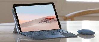
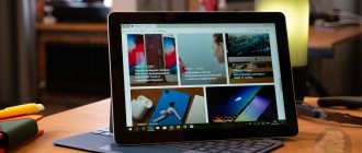
On the Microsoft website, a tablet with 4 GB of RAM and 64 GB of internal memory costs $399. If you increase the internal memory to 128 GB, then the Surface Go comes out to $499. Increasing RAM to 8 GB will cost $50. Well, the top version of the tablet with 8 GB of RAM, 128 GB of its own and an LTE modem costs $679.
These are American prices. In Russia, Surface Go in its minimum configuration costs about 37 thousand rubles. In my opinion, it’s better to buy the top version of the tablet, which has 8/128 GB, and that’s already about 47 thousand. Let's add a keyboard here, and that's another 12 thousand. We take out a calculator, the amount turns out to be around 60 thousand rubles - it’s easier to buy a small 13-inch laptop.
Would I buy a Surface Go? No, I vote for a regular lightweight laptop. But at the same time, I liked little Microsoft. If you need Windows in a small and mobile device and you understand that you will enjoy working on a 10-inch screen, then why not.
Computing power and graphics: faster than ever
Our test unit, priced at $2,199, had an Intel Core i7-7660U processor with 16 GB of RAM and a 512 GB SSD. With this configuration, you can expect the Surface Pro to be very fast. And indeed it is. It easily beats competing high-end ultraportables in almost every test and benchmark. In everyday use, it never showed a hint of stuttering or stuttering, including during rated workloads that included running 20 or more browser tabs, editing photos, watching YouTube, and working with multiple Excel spreadsheets.
On Geekbench 4, which measures basic system performance, the Surface Pro scored (8,878) 10 percent higher than the XPS 13 (8,104) and HP Specter x360 (8,145), which also have 7th-generation Intel Core i7 processors.
The Surface Pro also beat the competition in our spreadsheet test. It managed to match 20 thousand names and addresses in just 3:12, versus 3:43 for the XPS 13 and 3:32 for the Specter x360.
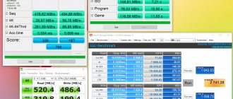
The 512 GB SSD drive was pleasantly surprised by its speed, especially compared to the storage device on the Surface Laptop, which was not very fast. The new SSD copied multimedia files from a DVD in just 15 seconds, achieving a transfer speed of 338 MB/s. The XPS 13's speed in the same task was 190 MB/s, while the Specter x360 was closest to the Surface Pro with a speed of 318 MB/s.
The battery lasted 7 hours 25 minutes, which is much better than the 6 hours 5 minutes that the previous Surface Pro 4 showed.
The Surface Pro scored 1,568 points in the 3DMark Fire Strike graphics test. This is 50% better than the result of the XPS 13 (926) and Specter x360 (921). But if you plan to enjoy top-end games, you'll be better off considering something with a discrete graphics card instead of the built-in Iris Plus Graphics 640.
What else should you pay attention to before buying a Microsoft Surface?
From a small tablet with modest capabilities, the Microsoft Surface of 2012 has grown into a huge line of premium devices for professional use, capable of competing with the industry leader - Apple and its proud Macs . But there are several nuances without which not a single Surface purchase .
1. Surface Pen is not included . Starting from 2018, you will have to buy an additional stylus, but stores often run promotions and give it as a gift. 2. USB Type-C is not available on all models . Only the Surface Book 2 and Surface Go have USB-C, but the latter also lacks other connectors, which causes inconvenience due to adapters. 3. Thunderbolt 3 does not work . The interface is not supported at all, forget about Thunderbolt devices. 4. High price for Surface accessories . Case, cover, keyboard, stylus, additional devices - all this must be purchased separately for the cost of a budget smartphone.
5 longest lasting laptops
If you have any questions about the Microsoft Surface line, write to us in the comments or send a message on VKontakte @NeovoltRu to get a response. Subscribe in the group to news from the world of gadgets, learn about improving their autonomy and progress in scientific research on batteries. Connect with us on Facebook and Twitter.
Battery life: already better, but I want more
One of the biggest weaknesses of 2-in-1 devices, including the previous Surface Pro 4, is battery life compared to traditional laptops. To solve this problem, according to Microsoft itself, in the new version the battery life has been increased by 50 percent. In our test, which included Internet surfing via Wi-Fi, the “test” lasted 7 hours 25 minutes, which significantly exceeds the 6:10 indicator of the old version of the laptop.
The bad news for Microsoft is that comparing the Surface Pro to systems like the XPS 13 and Specter x360 doesn't end in the Surface's favor—its competitors last an hour and a half to two hours longer. Their times were 9:12 and 10:07. Even the Surface Laptop from the same Microsoft puts a serious blow to the Surface Pro with a time of 9:02. So while improved battery life is a welcome addition to the new Surface, it still has room for further upgrades.
In addition, do not forget about the existence of the 10.5-inch iPad Pro. Its smaller screen size and less mobile-friendly OS prevent it from truly competing with the Surface Pro—its 13.5 hours of battery life are hard to beat.

