The simplest change schedule
A graph is needed when it is necessary to show changes in data. Let's start with a simple diagram to show events over different periods of time.
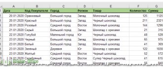
Let's say we have data on the net profit of an enterprise for 5 years:
| Year | Net profit* |
| 2010 | 13742 |
| 2011 | 11786 |
| 2012 | 6045 |
| 2013 | 7234 |
| 2014 | 15605 |
* Figures are conditional, for educational purposes.
Go to the “Insert” tab. There are several types of charts available:
Select "Graph". The pop-up window shows its appearance. When you hover your cursor over a particular type of chart, a hint appears: where it is best to use this chart, for what data.
Selected - copied the table with data - pasted it into the diagram area. This turns out to be the following option:
Straight horizontal (blue) is not needed. Just select it and delete it. Since we have one curve, we also remove the legend (to the right of the graph). To clarify the information, sign the markers. On the “Data Signatures” tab we determine the location of the numbers. In the example - on the right.
Let's improve the image - label the axes. “Layout” – “Name of axes” – “Name of the main horizontal (vertical) axis”:
The title can be removed or moved to the chart area, above it. Change the style, fill, etc. All manipulations are on the “Chart Name” tab.
Instead of the serial number of the reporting year, we need exactly the year. Select the values of the horizontal axis. Right-click – “Select data” – “Change horizontal axis labels”. In the tab that opens, select a range. In a table with data - the first column. As below picture:
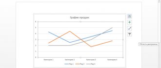
We can leave the schedule as is. Or we can fill it, change the font, move the diagram to another sheet (“Designer” - “Move diagram”).
How to create a chart in Excel
How to make diagrams in Excel? There is nothing complicated here either. Go to the program, click again on the “Insert” tab, then you need to select the “Histogram” or “Other charts” function
(Figure 3).
As we can see in the fourth picture, we are offered a wide range of diagrams to choose from. Choose at your own discretion which diagram suits you best (Figure 4).
If you go to “Other diagrams” you can consider even more possibilities. After we selected the bar chart, we got this result (Figure 5).
Click on “All types of diagrams” and from there you can take the diagram you need.
Adding a Second Axis
How to add a second (additional) axis? When the units of measurement are the same, we use the instructions suggested above. If you need to show data of different types, you will need an auxiliary axis.
First, we build a graph as if we have the same units of measurement.
Select the axis for which we want to add an auxiliary one. Right mouse button – “Data series format” – “Series parameters” – “Along auxiliary axis”.
Click “Close” - a second axis appears on the chart, which “adjusts” to the curve data.
This is one way. There is another one - changing the chart type.
Right-click on the line for which an additional axis is needed. Select “Change chart type for series.”
We decide on the type for the second row of data. The example is a bar chart.
Just a few clicks – an additional axis for another type of measurement is ready.
Creating a diagram
We will solve the problem in different ways, but you will choose the most suitable one. So let's get started.
bar chart
This type is suitable when we just need to visually display values, or compare them with others.
- In order to start creating a diagram, you should initially have the data that will form its basis. Therefore, select the entire column of numbers from the plate and press the Ctrl+C button combination.
- Next, click on the Insert tab and select a histogram. It will display our data in the best possible way.
- As a result of the above sequence of actions, a diagram will appear in the body of our document. First of all, you need to adjust its position and size. To do this, there are markers that can be moved.
- We configured the final result as follows:
- Let's give the sign a name. In our case, these are product prices. To get into editing mode, double-click on the chart title.
- You can also get into the editing mode by clicking on the button marked with the number 1 and selecting the Axis Name function.
- As you can see, the inscription appeared here too.
This is what the result of the work looks like. In our opinion, quite good.
Comparison of different values
If you have several values, you can also add them here, so we can get excellent material for visual comparison.
- Copy the numbers in the second column.
- Now select the diagram itself and press Ctrl+V. This combination will insert data into an object and force it to be organized into columns of different heights.
There are hundreds of other types of graphs in the program, they can be found in the Insert menu. Through trials and combinations, each one must be dealt with separately.
Percentage
In order to more clearly understand the role of the various cells of our table and its values in general, we can compare the results in the form of a pie chart. Moreover, we will do this with the conclusion of the percentage. Let's get started.
- As in previous cases, we copy the data from our plate. To do this, just select them and press the key combination Ctrl+C. You can also use the context menu.
- Click on the Insert tab again and select the pie chart from the list of styles.
- Once the output method is added, you will see the following picture:
- Next, we need to change the style and select a profile that displays percentages. This is done after selecting the finished object in the list of styles.
- Well, a completely different result. The diagram looks quite professional. We managed to create a truly excellent visual indicator.
All parameters, including colors, fonts and their shadows, are flexibly configured in Microsoft Excel. The abundance of control elements is truly great.
Building a graph of functions in Excel
All work consists of two stages:
- Creating a table with data.
- Building a graph.
Example: y=x(√x – 2). Step – 0.3.
Let's make a table. The first column is the X values. We use formulas. The value of the first cell is 1. The second: = (name of the first cell) + 0.3. Select the lower right corner of the cell with the formula - drag it down as much as necessary.
In the Y column we write the formula for calculating the function. In our example: =A2*(ROOT(A2)-2). Press "Enter". Excel calculated the value. We “multiply” the formula throughout the entire column (by pulling the lower right corner of the cell). The data table is ready.
We move to a new sheet (you can stay on this one - put the cursor in a free cell). “Insert” - “Diagram” - “Scatter”. Choose the type you like. Right-click on the chart area and select “Select Data.”
Select the X values (first column). And click “Add”. The Edit Series window opens. Set the name of the series – function. X values are the first column of the data table. Values Y – second.
Click OK and admire the result.
The Y axis is fine. There are no values on the X axis. Only point numbers are indicated. This needs to be fixed. It is necessary to label the graph axes in Excel. Right mouse button – “Select data” – “Change horizontal axis labels”. And select the range with the required values (in the table with the data). The schedule becomes what it should be.
How to build a graph in Excel based on data from a table with two axes
Let's imagine that we have data not only on the dollar exchange rate, but also on the euro, which we want to fit on one chart:
To add Euro exchange rate data to our chart, you need to do the following:
- Select the graph we created in Excel with the left mouse button and go to the “Design” tab on the toolbar and click “Select data”:
- Change the data range for the created graph. You can change the values manually or select an area of cells by holding the left mouse button:
- Ready. The chart for the Euro and Dollar exchange rates is built:
If you want to display chart data in different formats along two axes X and Y, then for this you need:
- Go to the “Designer” section on the toolbar and select “Change chart type”:
- Go to the “Combined” section and for each axis in the “Chart Type” section, select the appropriate type of data display:
- Click “OK”
Below we will look at how to improve the information content of the resulting graphs.