Insert and build
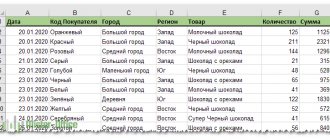
For example, we use a table of revenue and expenses for the year, based on which we will build a simple graph:
| Jan.13 | Feb.13 | Mar.13 | Apr.13 | May.13 | Jun.13 | Jul.13 | Aug.13 | Sep.13 | Oct.13 | Nov.13 | Dec.13 | |
| Revenue | RUB 150,598 | RUB 140,232 | RUB 158,983 | RUB 170,339 | RUB 190,168 | RUB 210,203 | RUB 208,902 | RUB 219,266 | RUR 225,474 | RUB 230,926 | RUB 245,388 | 260 350 rub. |
| Expenses | RUB 45,179 | 46,276 rub. | RUB 54,054 | RUB 59,618 | RUB 68,460 | RUR 77,775 | RUR 79,382 | RUB 85,513 | 89,062 rub. | RUB 92,370 | RUB 110,424 | RUB 130,175 |
Regardless of the type used, be it a histogram, surface, etc., the fundamental principle of creation does not change. On the “Insert” tab in Excel, you need to select the “Charts” section and click on the required icon.
Select the empty area you created to make additional ribbon tabs appear. One of them is called “Designer” and contains the “Data” area, on which the “Select data” item is located. Clicking on it will bring up the source selection window:
Pay attention to the very first field “Data range for chart:”. With its help, you can quickly create a graph, but the application cannot always understand exactly how the user wants to see it. Therefore, let's look at a simple way to add rows and axes.
On the window mentioned above, click the “Add” button in the “Legend Elements” field. The “Change Series” form will appear, where you need to specify a link to the series name (optional) and values. You can specify all indicators manually.
After entering the required information and clicking the “OK” button, the new series will appear on the chart. In the same way, we will add another legend element from our table.
Now let's replace the automatically added labels along the horizontal axis. In the data selection window there is a category area, and in it there is a “Change” button. Click on it and add a link to the range of these signatures in the form:
Look what should happen:
Creating a graph in Excel 2010
First, let's launch Excel 2010. Since any chart uses data for construction, let's create a table with example data.
Rice. 1. Table of values.
Cell M stores the name of the graph. For example, “Characteristic 1” is indicated, but there you need to indicate exactly what the future schedule will be called. For example, “Bread prices in January.”
Cells N to AC contain, in fact, the values on which the graph will be built.
Select the created table with the mouse, then go to the “ Insert ” tab and in the “ Charts ” group select “ Graph ” (see Fig. 2).
Rice. 2. Selecting a schedule.
Based on the data in the table that you selected with the mouse, a graph will be created. It should look like Figure 3:
Rice. 3. New schedule.
Left-click on the name of the graph and enter the desired name, for example “Chart 1”.
Then, in the Chart Tools , select the Layout . In the “ Labels ” group, select “ Axis Titles ” - “ Main Horizontal Axis Title ” - “ Title Below Axis ”.
Rice. 4. Name of the horizontal axis.
At the bottom of the chart, the label “ Axis Title ” will appear below the horizontal axis. Left-click on it and enter a name for the axis, for example, “ Days of the month ”.
Now also in the Chart Tools , select the Layout . In the " Labels " group, select " Axis Titles " - " Major Vertical Axis Title " - " Rotated Title ".
Rice. 5. Name of the vertical axis.
On the left side of the chart, the label “ Axis Title ” will appear next to the vertical axis. Left-click on it and enter the name of the axis, for example, “Price”.
The resulting graph should look like Figure 6:
Rice. 6. Almost finished schedule.
As you can see, everything is quite simple.
Now we’ll talk about additional features for working with graphs in Excel.
Select the graph and on the Layout , in the Axes , select Axes - Primary Horizontal Axis - Advanced Primary Horizontal Axis Options .
A window that seems frightening at first glance will open (Fig. 7):
Rice. 7. Additional axis parameters.
Here you can specify the interval between the main divisions (top line in the window). The default is "1". Since our example shows the dynamics of bread prices by day, we will leave this value unchanged.
“ Label Spacing ” determines at what increments the tick labels will be displayed.
The “ Reverse order of categories ” checkbox allows you to expand the graph “horizontally”.
In the drop-down list next to “ Main ”, select “ Intersect Axis ”. We do this so that lines appear on the graph. Select the same thing in the drop-down list next to “ Intermediate ”. Click the " Close " button.
Now on the Layout in the Axes , select Axes - Primary Vertical Axis - Advanced Primary Vertical Axis Options .
A window slightly different from the previous one will open (Fig. 8):
Rice. 8. Parameters of the horizontal axis.
Here you can change the start and end value of the vertical axis. In this example, we will leave the value “ auto ”. For the item “ Price of main divisions ” we will also leave the value “ auto ” (5). But for the item “ Price of intermediate divisions ” we will select the value 2.5 .
Now let's also enable the display of strokes on the axes. To do this, in the drop-down lists next to the inscriptions “ Main ” and “ Intermediate ”, select “ Intersect the axis ”. Click the " Close " button.
After the changes we made, the graph should look like this (Fig. 9):
Rice. 9. Final view of the graph.
You can add another line to the chart, for example, “milk prices in January.” To do this, let’s create another row in the data table (Fig. 10):
Rice. 10. Data table.
Then select the chart by clicking on it, and on the “ Design ” tab, click “ Select data ” (Fig. 11):
Rice. 11. Updating data on the diagram.
A window will appear in which you need to click the button opposite the inscription “ Data range for the chart ”, indicated by a frame (Fig. 12):
Rice. 12. Selecting a data range.
After clicking the button, the window will “collapse” and you will need to use the mouse to select the data area - the updated table. Then press the designated button again and then press the OK .
As a result, the new chart with two graphs should look like shown in Figure 13:
Rice. 13. Chart with two graphs.
Using the described method, you can create as many graphs as needed on one chart. To do this, you simply add new rows to the data table and update the data range for the chart.
Chart elements
By default, the chart consists of the following elements:
- Data series are of main value because... visualize data;
- Legend – contains the names of the rows and an example of their design;
- Axes – a scale with a certain value of intermediate divisions;
- The plot area is the background for the data series;
- Grid lines.
In addition to the objects mentioned above, the following can be added:
- Chart titles;
- Projection lines – descending from data series to the horizontal axis of the line;
- Trend line;
- Data labels – the numeric value for a data point in a series;
- And other infrequently used elements.
Editing charts
Once you've finished creating your diagrams, you can change them at any time. Simultaneously with the diagram that appears, a group of tabs with the general name “Working with Diagrams” automatically appears, and a transition to the first of them, “Designer,” occurs. New tab tools provide extensive chart editing capabilities.
Design Tab
A pie chart in Excel is often used to display percentage values. To build a pie chart, preserving the previous data, you need to click the first ruler tool on the left - “Change chart type”, and select the desired subtype of the “Pie” line.
The following screenshot shows the result of activating the “Row/Column” tool, which mutually replaces data on the X and Y axes. As you can see, the monochromatic histogram of the previous screenshot received colors and became much more attractive.
In the Chart Styles section of the Design tab, you can change the chart style. After opening the drop-down list in this section, the user can choose one of the 40 proposed variations of styles. Without opening this list, only 4 styles are available.
The last tool, Move Chart, is very valuable. With its help, the diagram can be transferred to a separate full-screen sheet.
As you can see, the sheet with the diagram is added to the existing sheets.
If the user has to work on building many other diagrams based on the created and edited one, then he can save it for further use as a template. To do this, just select the diagram, click the “Save as Template” tool, enter a name and click “Save”. After this, the saved template will be available in the “Templates” folder.
Layout and Format tabs
The tools on the Layout and Format tabs primarily deal with the appearance of the chart.
To add a title, click Chart Title, select one of the two proposed layout options, enter a name in the formula bar, and press Enter.
If necessary, names are added similarly to the X and Y axes of the chart.
The Legend tool controls the display and position of descriptive text. In this case, these are the names of the months. They can be deleted or moved left, up or down.
Much more common is the “Data Labels” tool, which allows you to add numeric values to them.
If the volumetric version was selected when constructing the diagram, then the “Rotate 3D” tool will be active on the “Layout” tab. With its help you can change the viewing angle of the diagram.
The Shape Fill tool of the Format tab allows you to fill the background of the chart (as shown in the screenshot) or any of its elements (in this case, the bars) with any color, pattern, gradient or texture.
To fill the corresponding element, it must first be selected.
Adding new data
After you create a chart for one data series, in some cases you may need to add new data to the chart. To do this, you will first need to select a new column - in this case, “Taxes”, and remember it in the clipboard by pressing Ctrl+C. Then click on the diagram and add the saved new data to it by pressing Ctrl+V. A new data series “Taxes” will appear on the chart.
Changing the style
You can use the default styles provided to change the appearance of your chart. To do this, select it and select the “Design” tab that appears, on which the “Chart Styles” area is located.
Often the available templates are sufficient, but if you want more, you will have to create your own style. This can be done by right-clicking on the chart object being changed, selecting “Element_Name format” from the menu and changing its parameters through the dialog box.
Please note that changing the style does not change the structure itself, i.e. the diagram elements remain the same.
The application allows you to quickly rebuild the structure through express layouts, which are located in the same tab.
As with styles, each element can be added or removed individually. In the Excel 2007 version, an additional “Layout” tab is provided for this, and in the Excel 2013 version, this functionality has been moved to the “Design” tab ribbon, in the “Chart Layouts” area.
How to add a title to a chart
If you want to change the name, make it more clear, or remove it altogether, you will need to do the following . In Excel 2003, you need to click anywhere on this chart, after which you will see the Chart Tools , with tabs Layout , Format and Design . In the Layout/Labels , select Title . Change the parameters you need.
The title can be associated with any table cell by marking the link to it. The associated title value is automatically updated when it is changed in the table.
Types of charts
Schedule
Ideal for displaying changes in an object over time and identifying trends. An example of displaying the dynamics of costs and total revenue of a company for the year:
bar chart
Good for comparing multiple objects and changing their relationship over time. An example of comparing the performance indicator of two departments quarterly:
Circular
Used to compare the proportions of objects. Cannot display dynamics. An example of the share of sales of each product category from total sales:
Area chart
Suitable for displaying the dynamics of differences between objects over time. When using this type, it is important to maintain the order of the rows, because they overlap each other.
Let's say there is a need to display the workload of the sales department and its coverage by personnel. For this purpose, indicators of employee potential and workload were brought to a common scale.
Since it is paramount for us to see the potential, this row is displayed first. From the diagram below it is clear that from 11 a.m. to 4 p.m. the department cannot cope with the flow of clients.
Spot
It is a coordinate system where the position of each point is specified by values along the horizontal (X) and vertical (Y) axes. A good fit when the value (Y) of an object depends on a certain parameter (X).
Example of displaying trigonometric functions:
Surface
This type of chart represents three-dimensional data. It could be replaced with several rows of a histogram or graph, if not for one feature - it is not suitable for comparing the values of rows, it provides the opportunity to compare values in a certain state with each other. The entire range of values is divided into subranges, each of which has its own shade.
Exchange
From the name it is clear that this type of chart is ideal for displaying trading dynamics on exchanges, but can also be used for other purposes.
Typically, such charts display the fluctuation corridor (maximum and minimum values) and the final value in a certain period.
Petal
The peculiarity of this type of chart is that the horizontal axis of values is located in a circle. Thus, it allows you to more clearly display the differences between objects in several categories.
The diagram below shows a comparison of 3 organizations in 4 areas: Accessibility; Price policy; Product quality; Customer focus. It can be seen that company X is the leader in the first and last areas, company Y in product quality, and company Z provides the best prices.
We can also say that company X is a leader, because The area of her figure in the diagram is the largest.
Creating Charts
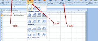
1. First of all, you need to select a section of the table based on the data of which you want to build a chart in Excel. In the example given, all data is highlighted - income, taxes and interest.
2. Go to the “Insert” tab, and in the “Diagrams” section, click the desired view.
3. As you can see, in the “Diagrams” section the user is offered different types of diagrams to choose from. The icon next to the name visually explains how the selected chart type will be displayed. If you click on any of them, the user is offered subspecies in the drop-down list.
Sometimes the expression “Charts and graphs” is used, thereby highlighting the graphical view as a separate category.
If the user needs the first of the proposed options - a histogram, then, instead of performing paragraphs. 2 and 3, he can press the key combination Alt+F1.
4. If you look closely at the subspecies, you will notice that everyone belongs to one of two options. They are distinguished by solid (green rectangle) or partial (orange) shading of the diagram elements. The next two screenshots, corresponding to the “green” and “orange” selections, clearly demonstrate the difference.
As you can see, in the first case, the displayed data is arranged in three columns (income, taxes, percentage). The second option displays them as shaded parts of one column.
In both cases, the percentage value is almost invisible. This is due to the fact that the diagrams display its absolute value (i.e. not 14.3%, but 0.143). Against the background of large values, such a small number is barely visible.
To make a chart in Excel for data of one type, you should select them as part of the first step. The next screenshot shows a diagram for percentage values that were practically not visible in the previous ones.
Mixed chart type
Excel allows you to combine several types in one chart. As an example, the graph and histogram types are compatible.
To begin with, all rows are built using one type, then it changes for each row separately. By right-clicking on the required series, select “Change chart type for series...” from the list, then “Histogram”.
Sometimes, due to strong differences in the values of the chart series, using a single scale is impossible. But you can add an alternative scale. Go to the “Data Series Format...” menu and in the “Series Options” section, move the checkbox to “Along Minor Axis.”
The diagram now looks like this:
How to build a Pareto chart in Excel
Vilfredo Pareto discovered the 80/20 principle. The discovery took root and became a rule applicable to many areas of human activity.
According to the 80/20 principle, 20% of efforts produce 80% of the results (only 20% of the reasons will explain 80% of the problems, etc.). The Pareto chart reflects this relationship in the form of a histogram.
Let's build a Pareto curve in Excel. There is some event. It is influenced by 6 reasons. Let's evaluate which of the reasons has a greater impact on the event.
- Let's create a table with data in Excel. Column 1 – reasons. Column 2 – the number of facts at which these reasons were discovered (numeric values). Definitely the result.
- Now let’s calculate the percentage impact of each cause on the overall situation. Create a third column. We enter the formula: number of facts for a given reason / total number of facts (=B3/B9). Press ENTER. Set the percentage format for a given cell - Excel automatically converts the numeric value to a percentage.
- Let's sort the percentages in descending order. Let’s select the range: C3:C8 (except for the total) – right mouse button – sort – “from maximum to minimum”.
- We find the total influence of each cause and all previous ones. For reason 2 – reason 1 + reason 2.
- The “Facts” column is auxiliary. Let's hide it. Select a column - right mouse button - hide (or press the hotkey combination CTRL+0).
- We select three columns. Go to the “Charts” tab - click “Histogram”.
- Select the vertical axis with the left mouse button. Then press the right key and select “Format Axis”. Set the maximum value to 1 (i.e. 100%).
- Add data signatures for each row (select - right button - “Add data signatures”).
- Select the row “Sum.influenced.” (green in the figure). Right mouse button – “Change chart type for series”. “Graph” is a line.
The result was a Pareto chart, which shows: reasons 3, 5 and 1 had the greatest influence on the result.
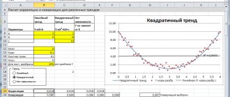
Excel Trend
Each row of the chart can have its own trend. They are necessary to determine the main focus (trend). But for each individual case it is necessary to apply your own model.
Select the data series for which you want to build a trend and right-click on it. In the menu that appears, select “Add trend line...”.
Various mathematical methods are used to determine a suitable model. We will briefly look at situations when it is better to use a certain type of trend:
- Exponential trend. If the values on the vertical axis (Y) increase with each change in the horizontal axis (X).
- A linear trend is used if the Y values have approximately the same change for each X value.
- Logarithmic. If the change in the Y axis slows down with each change in the X axis.
- A polynomial trend is used if changes in Y occur both upward and downward. Those. the data describes the cycle. Well suited for analyzing large data sets. The trend degree is selected depending on the number of cycle peaks: Degree 2 – one peak, i.e. half cycle;
- Degree 3 – one full cycle;
- Level 4 – one and a half cycles;
- etc.
Linear filtering. Not applicable for forecasting. Used to smooth out changes in Y. Averages the change between points. If in the trend settings the point parameter is set to 2, then averaging is performed between adjacent values of the X axis, if 3 then after one, 4 after two, etc.
Pivot chart
It has all the benefits of regular charts and pivot tables, without the need to create one.
The principle of creating pivot charts is not much different from creating pivot tables. Therefore, this process will not be described here, just read the article about pivot tables on our website. Moreover, you can create a diagram from an already constructed table in 3 clicks:
- Select the PivotTable;
- Go to the “Analysis” tab (in Excel 2007, the “Options” tab);
- In the Tools group, click the PivotChart icon.
To build a pivot chart from scratch, select the appropriate icon on the “Insert” tab. For the 2013 application it is located in the “Charts” group, for the 2007 application in the table group, the “Pivot Table” drop-down list item.
- < Back
- Forward >
Similar articles:
- Dynamically color-changing Excel histogram bars
New articles:
- Mann-Whitney test
- Connecting MySQL to Excel
- Connecting Excel to SQL Server
Features of data presentation
To build a secondary pie chart, you need to select the table with the source data and select the “Secondary Pie” tool on the “Insert” tab in the “Charts” group (“Pie”):
- Two diagrams are always placed in the same plane. The main and secondary circle are next to each other. They cannot be moved independently. The main diagram is located on the left.
- The main and secondary charts are parts of the same data series. They cannot be formatted independently of each other.
- The sectors on the secondary circle also show shares as on the regular chart. But the sum of the percentages does not equal 100, but constitutes the total value of the sector of the main pie chart (from which the secondary one is separated).
- By default, the secondary circle displays the last third of the data. If, for example, there are 9 rows in the original table (for a chart there are 9 sectors), then the last three values will appear on the secondary chart. The original location of the data can be changed.
- The relationship between two diagrams is shown by connecting lines. They are added automatically. The user can modify, format, delete them.
- The more decimal places for fractional numbers in the original data series, the more accurate the percentages in the charts.