Today we will talk about gradients in Photoshop . Gradient is an important tool in Photoshop. In this tutorial I will teach you how to use it. You will learn how to create and save a gradient, what types of gradients there are, and of course, in what situations you should use a gradient.
First, let's find out what a gradient is. A gradient is a fill with a smooth transition of several (two or more) colors into each other.
Photoshop allows you to fill a new or existing layer with a gradient, and the gradient is also used in layer styles (read more about styles in the “Photoshop Layers” lesson). The gradient also plays a significant role in layer masks. However, any gradient obeys the same rules, which we will talk about now.
Creating a new document
We'll start by creating a new document. To create, go to the File > New menu.
The New dialog box opens. I used the following dimensions for the document 1200x800 pixels. The size I specified does not play a huge role here, so you can set any one you wish. Leave the resolution at 72 pixels/inch, the background content is white. After all changes, click OK.
Gradient palette
Now we need to select the gradient itself that we will use, there are several ways to do this. The first is to open the Gradient Palette, the second is to open the large Gradient Editor window. The difference between the two is that in the Gradient Picker you can select a pre-made gradient, while in the Gradient Editor (the name says it all) you can edit and create your own gradients. Today we will pay more attention to the Gradient Palette.
If you need to choose one of Photoshop's standard gradients, or one you created earlier and saved as a custom swatch, then click on the small arrow on the right side of the preview panel.
To select the gradient you like, simply double-click on the thumbnail or press Enter.
Gradient panel
From this panel you can quickly select the gradient you need, if it is there, of course. Otherwise, you'll have to customize your own gradient in the Gradient Editor. But we will talk about it below.
By clicking on the round button you will be taken to the gradient panel menu. This is a standard menu, exactly the same for brushes, styles, contours, and shapes. Everywhere this menu does the same thing. Allows you to create and save a new gradient. Rename, delete. Call Preset manager in which you can do more than anything. Load new gradients, or save the existing ones, clear them, return to standard settings and, of course, load ready-made template collections of Photoshop gradients, which are also not superfluous.
Loading additional gradient sets
By default, Photoshop has several gradient swatches available, but you can use other standard presets. Open the gradient palette again, there is a gear icon at the top right, click on it.
As a result, a list opened, at the bottom of it there are additional sets of gradients, each of which is based on a specific theme, for example, metallic, pastel, noise, etc. If you are a photographer, then you will find kits such as Neutral Density and Photographic Toning useful.
Select any set from the list provided, I chose Photographic Toning. Photoshop will ask you if you want to replace the current gradients with new ones. If you click Append it will simply add new gradients below the originals. As you can see, it shouldn't be too difficult to restore the original set, so I'll click OK to replace them with the Photographic Toning set.
Please note in the gradient panel, the initial set has been replaced with a new one. Let's not stop there, let's move on.
Creating gradient maps
The easiest way to create a gradient map in Photoshop is to go to the Tools panel and set the Background and Foreground colors to whatever you want at either end of the gradient. Then when you open the gradient map, the colors are already there.
If you want to use exact colors in your gradient map—perhaps even additional colors you found online—you can enter hexadecimal numbers into the color picker instead of randomly selecting them.
Needless to say, not all gradient maps are suitable for all images. One way to create useful gradient maps is to search for color schemes online.
You can use "Adobe Color" to find the perfect complementary color to the one you selected on the wheel. Accordingly, create a gradient map from the proposed colors.
Method 1
A more customized way to create a gradient map looks like this:
- Open your image in Photoshop.
- Open the gradient map adjustment layer.
- Set the blending mode to Soft light ( Soft ligh) or Overlay ( Overlay) .
- Click the gradient to open the gradient editor.
- Click the left color stop (the square slider in the lower left corner), then click in the activated color box.
- At this point, you can adjust the color of the shadow and see its effect in real time on the photo by moving the color picker.
- Do the same with the right highlight color button.
You now have a custom gradient map for this image.
If you're using a Gradient Map adjustment layer rather than direct editing, you have a built-in layer mask . In this painting, we wanted the water to be a deep purple-burgundy color that contrasts well with the reflective light, but we didn't want to lose the cool shadows in the buildings. We brushed the buildings over a mask, so the gradient map only affects the water and sky.
Original
Adding a Gradient
Customizing colors
Working with a Layer Mask
Foreground to Background Gradient
Before we start creating gradients, let's look at one of them, namely the Foreground to Background gradient. Photoshop selects it by default. He is number one on the list.
There is an icon for choosing foreground and background colors in the toolbar. By default, the foreground color is set to black and the background color to white.
The Foreground to Background gradient is the easiest to set up and is also the most common. As further examples, I chose this one.
The process of creating a gradient
See also: “How to even out your complexion in Photoshop”
The Photoshop graphics editor already contains a palette of preset gradients. You can also find a wide variety of gradient palettes created by other users on the Internet.
If, after familiarizing yourself with the ready-made gradient palettes, you could not find the right one, you can create it yourself by following the instructions below:
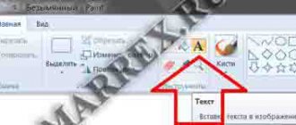
- Select “Gradient” in the main toolbar on the left by left-clicking on it. In some cases, when this “Gradient” is not selected by default in the group of filling tools, first right-click on the group, then select the item we need from the proposed list.
- In the panel with gradient settings that appears at the top of the window, find a button that opens a window for editing it and click on it. IMPORTANT: the gradient settings window will open only when you click on the button itself, and not on the arrow to the right of it.
Creating a gradient with the Gradient Tool (G)
To create a gradient you need to set the starting point and move the mouse cursor in the desired direction. Set the starting point of the gradient on the working document, then, without releasing the mouse cursor, move the gradient line to another part of the document. The line that appears indicates the direction of the gradient. When you release your mouse button, Photoshop creates a gradient with the colors you selected.
I created a gradient from the left side of the canvas to the right. If you need to get a perfectly straight line, then hold Shift while creating. Then first release the mouse button and then the Shift key.
As I said, Photoshop will create a gradient from the colors you selected. I ended up with a black and white gradient.
LiveInternetLiveInternet
Monday, July 07, 2014 16:13 + in quote book Using a gradient fill in Photoshop The Gradient tool allows you to create a gradually changing overlay of several colors. You can choose from prepared gradient fills or create your own. Note. The Gradient tool cannot be used with bitmap or indexed color images. Filling an area taking into account the gradient is done by dragging the cursor over the image. The appearance of a gradient fill is determined by where the start (where the mouse button was pressed) and end (where the mouse button was released) points are located, based on the Gradient tool used. 1. To fill part of the image, select the desired area. (1) (Figure 1) Otherwise, the gradient fill is applied to the entire active layer. 2. Select the Gradient Tool (1). (Image 2) Select the Gradient Fill from the Options Bar. - Click the triangle next to the gradient swatch (2) to select a pre-made gradient fill. (3) - Click inside the gradient swatch (4) to display the Gradient Editor window (Figure 3). 3.Select a prepared gradient fill option (1) or create a new gradient fill (2) (see below for how to create). Then click the "OK" button (3).
4. Select the gradient fill option you want to apply from the Options Bar. (Figure 4) Linear Gradient (1) Shades from the start to end point in a straight line. Radial Gradient (2) Shades from the start to end point in a circular pattern. Cone Gradient (3) Performs shading in a spiral that unwinds counterclockwise around the starting point. Mirror Gradient (4) Performs shading using symmetrical linear gradients on either side of the starting point. Diamond Gradient (5) Shades in all directions from the starting point in a diamond pattern. The end point defines one of the corners of the diamond. In the options panel, do the following: — Specify the blending mode (6) and opacity for the paint. (7) - To reverse the order of colors in a gradient fill, check the Invert checkbox. (8) - To create a smoother overlay with fewer streaks, check the Dither checkbox. (9) - To use a transparency mask for a gradient fill , select the Transparency checkbox. (10) 5.Place the cursor where you want to set the starting point of the gradient (1), and drag the cursor to determine the end point (2). To constrain the line angle to be a multiple of 45°, hold down the Shift key while dragging the cursor (Figure 5)
6.Result:
7.Create a new gradient fill:(Figure 7) To base a new gradient on an existing gradient, select the gradient in the Presets section of the dialog box.(1) - Select Continuous from the Gradient drop-down menu.(2) - To define the starting color of the gradient, click the left color stop (3) .
8. The color of the triangle above the control point is colored, (1) indicating that the starting color is being edited. To select a color, do one of the following. (Image - Double-click the color control point (2) or click the color swatch (3) under " Control Points" dialog box. Select a color and click OK. -Choose an option from the Color pop-up menu (4) in the Control Points section of the dialog box. -Move the cursor to the Gradient Picker (5) (the cursor changes to eyedropper) and click to sample a color, or click anywhere in the image to sample a color from the image. To determine the final color, click on the right color stop (6). Then select a color.
9. To adjust the location of the start point (1) or end point (2), do one of the following: (Figure 9) -Drag the appropriate color control point left or right to the desired location. -Click the appropriate color control point and set a value for Position (3) in the Control Points section of the dialog box. A value of 0% places the point at the far left end of the gradient picker, and a value of 100% places the point at the far right end. To adjust the location of the midpoint (4) (where the gradient displays an equal mixture of starting and ending colors), drag the diamond (4) below the gradient picker to the left or right, or click the diamond and set a value for Position (3).
10. To add intermediate colors to the gradient, click below the gradient picker (a hand should appear) to define another color stop (1). (Figure 10) Specify the color and adjust the location and midpoint for both the intermediate point and the start or end point. To remove an editable color stop, click the Delete button(2) or drag the stop down until it disappears.(3) To control how gradual the transitions between color bars in a gradient should be, enter a value in the Smoothness text box "(4) or drag the Smoothness slider that pops up(5). If necessary, set the transparency values for the gradient (6). Enter a name for the new gradient (7). To save the gradient as a prepared one, click the New button (8) after you've finished creating the gradient. Note. The newly prepared gradients are saved in the settings file and reflected in the set under a new name. If the gradient set is deleted or corrupted, or the gradients are reset to use the default library, the newly prepared gradients will be lost. To ensure that newly prepared gradients are always stored, save them in a library(9). If you need to load a new set of gradients, use the “Load” button (10)
That's all for now about how to apply a gradient fill. In order to better understand all this, open the picture and do it, move the sliders, change the values and look at the changes in the picture. And remember. It seems that everything is complicated, but when you do it yourself, what is written, everything will become clear and simple. Happy creativity!! Text source: Photoshop help (version 5)
| Categories: | Kubanochka Lessons/Photoshop Lessons |
Tags:
Kubanochka photoshop lesson Kubanochka lesson photoshop lesson
Cited 8 times Liked by: 7 users
Like share
0
Like
- 7
I liked the post - Quoted
- 0
Saved
- Add to quote book
- 0
Save to links
Liked7
0
Invert colors
You can change the colors the other way around. In the top settings panel there is such a Reverse function.
By selecting this function, I will create a gradient again, but this time the colors will be swapped. Don't forget to turn it off later.
Of course, gradients can be created not only from left to right, they can be created in any direction. Now I'll create a gradient from top to bottom, and I don't even need to delete the first gradient. Photoshop will automatically replace the current gradient with the new one. Simply click at the top of the document and drag the line down.
To get a perfectly straight line, hold down the Shift key when creating. After this, release first the mouse button and then the Shift key.
The program replaced the created horizontal black-and-white gradient with a vertical one.
Gradients for Photoshop. Application options
Author: Sergey Bunin. Date of publication: March 21, 2020. Category: Photo processing in Photoshop.
Gradients for Photoshop
Application options
In the first part of the material, we got acquainted with the Gradient tool, examined its types and settings, learned how to create our own fills and edit ready-made sets.
Now it's time to talk about application options.
A gradient is a tool that allows you to create a gradually changing overlay of several colors on your image.
From this definition it’s easy to guess where and for what you can use gradient fills, but we’ll look at how correctly and what options for use are in this part.
So, gradients for Photoshop and their applications.
If you create a new document with any background fill (the same as taking any color picture),
then using the “GRADIENT” TOOL we can recolor it in a color corresponding to the colors used in the gradient.
Moreover, the color of the left part of the gradient (left control point) will always determine the color of the beginning of the drawing line.
If you check the “Invert” checkbox in the tool control panel, the colors in the gradient will swap places and the situation with the document fill will naturally change to the opposite.
This use of the Gradient tool is rarely found in photo retouching, but it does occur in design work.
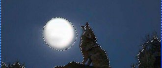
The most commonly used ADJUSTMENT LAYER is “Gradient Map”. Its main purpose is to bind the equivalent range of gray shades in the image to the colors of a specific gradient fill. To put it simply, a gradient is designed to fill an image based on its content and linked to the brightness in this image.
Let's look again at our image. In it, specifically for clarity, I did not arrange the gradations of gray color sequentially.
If, for example, we take a gradient with a two-color fill and apply it to this image, we will see that by default the dark areas of the image will correspond to the left control point of the gradient, and the right control point to the light ones. Areas of medium brightness will be painted in a mixed color, which determines the transition between the two colors of the fill used.
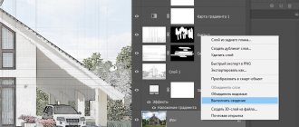
To edit a gradient fill, double-click the left mouse button on the “Gradient Map” layer thumbnail or simply go to the properties panel of this adjustment layer.
Next, click LMB on the gradient image and you will be taken to the gradient editor.
And as described in the first part of the material, create the gradient fill you need or modify an existing one.
In reality, the method of applying a gradient based on its contents can be used in split toning, where the shadows in an image are filled with one color and the highlights with another.
If you change the blending modes of the “Gradient Map” adjustment layer, you can achieve different and very interesting results.
You can control the effect of the gradient fill using the layer's opacity.
Or using the layer blending options.
If you double-click on the adjustment layer, you will be taken to the “Layer Style” dialog box. Here we will need the Overlay If field. We work in grayscale and with the scale of the underlying layer.
By moving the white slider to the left, you can limit the range of brightness that will be affected by the “Gradient Map” adjustment layer, thereby the light areas of the image located on the right side of the white slider will remain untouched, and those located on the left will be recolored in accordance with the applied fill in the gradient.
To avoid hard and jagged boundaries between dark and light areas, hold down the Alt key, move the mouse cursor over the white slider and move it a little to the right. The slider splits, the area between its parts determines the width and smoothness of the transition between the cut-off brightness zone.
In addition to filling with color (tinting), using gradients you can increase the contrast of the image.
There is a simple way to do this: in the properties of the “Gradient Map” adjustment layer, click LMB on the gradient fill scale, after which the gradient editor opens in front of us. In the list of sets, select the fill “Black, white”.
By clicking “Ok” in the editor, the image is immediately filled with a gradient and becomes more contrasting. By choosing the opacity of the adjustment layer, you can achieve results acceptable to you.
Using the same black and white gradient, you can easily create a vignette in a photo.
Let’s create a new adjustment layer “Curves” for our image.
Go to the properties of the adjustment layer and bend the curve towards the bottom, thereby shading the image.
We return to the layers panel and click LMB on the layer mask, it is activated, as evidenced by its selection with a dotted line.
On the toolbar, select “Gradient”, give it a radial appearance and in its editor turn to a black and white fill.
Set the cursor crosshair to approximately the center of the image, hold down the LMB and drag the gradient line to the side of the image, release the LMB.
The mask is filled with a black and white fill and, in accordance with the properties of transparency through black, the effect of the adjustment layer does not pass to the center of the image, and the edges are shaded.
Press the key combination “Ctrl+T”, a free transform frame appears. Based on the size and orientation of the photo, we will form a gradient fill area. Press “Enter”.
We get the following image with a vignette superimposed on it. The density of the mask (its opacity) and, therefore, the degree of shading and feathering of the edges can be adjusted in the properties panel of the mask itself.
Interesting examples of using gradients in collages when you need to combine two different images. This is done in a similar way, using a gradient fill on the layer mask of one of the images placed above the other.
We have looked at some of the main ways you can apply Gradients for Photoshop . Then everything depends on your imagination and resourcefulness.
Happy creative success!
If you don’t want to miss interesting lessons on photo processing, subscribe to the newsletter. The subscription form is below.
Seal
- Back
- Forward
Comments
0 Anatoly 05/18/2020 20:47 Thank you! It became much clearer
Reply | Reply with quote | Quote
0 Alex 03/24/2017 08:00 Thank you! Interesting!
Reply | Reply with quote | Quote
Update list of comments
Liked? Share:
Add a comment
Enter your name, or register on the site, so that your name is inserted automatically in the answers: it will take 2 minutes! After registering, you will be able to edit your messages and will not have to enter confirmation
.
To display an Avatar
(your picture), you must have an account on Gravatar at the same email address, it’s free.
JComments
Changing the gradient color
Since by default the gradient takes colors from the foreground and background, we can easily change its colors at any time. To start, click on the top “Foreground Color” box; it is currently colored black.
A color palette opened and I selected red. Click OK to close the Color Picker window.
Now let's change the background color, click on the farthest square, currently it is white.
The color palette opened again and I chose a bright yellow shade. Click OK.
Color swatches have been updated.
Notice the gradient in the top options bar, its colors have changed to the colors we selected.
Let's start creating a gradient, this time I will draw a line diagonally from the lower left corner to the upper right. There's no need to delete the gradient; Photoshop will automatically replace it with a new one.
We have a red-yellow diagonal gradient.
What does a gradient map do?
A gradient map in its simplest form is a smooth transition from one color (or tone) to another. Let's say you have a green to orange gradient map. When you apply it to an image, the shadows will have a green tint and the highlight will be orange. Midtones are usually the least affected, with the exception of more complex multi-color cards.
In this example, a black and white gradient occupies the bottom half of the image. Above is a map of the color gradient, and above it is the effect that is created when overlaying the middle one on the bottom, using the Overlay or Soft light .
You may be wondering: why distort the color of a photo and give existing shades and colors new tones? After all, it's almost the opposite of white balance correction.
One of the reasons to use a Gradient map is to enrich the colors that are already in a photo.
For example, in this version we emphasized the red brick and blue sky.
Another good reason to use gradient maps is to harness the power of complementary or original colors and create more attractive images. Sometimes the feeling of a photograph and the fabulousness is more important than the truth that exists in the first place.
Old color wheel illustration. Opposite colors are complementary colors, so they are a good choice for gradient maps.
If you infuse your shadows and highlights with complementary colors, you'll make the photo a little more eye-catching. This may not be noticeable right away, but it will still work in your favor. It's not a magic wand that makes all photos look great, but it's fun to experiment with. You become a colorist.
Creating a gradient on a separate layer
Look at the layers panel, you can see that up to this point I have created all the gradients on the background layer.
I showed you this as an example, but in work you need to create each element on a separate layer. First, remove the gradient by filling the background layer with white. To do this, go to the Edit menu and select Fill.
In the fill window, set the color to white and click OK. This will fill the background layer with white.
Now I will create the next gradient on a separate layer. Hold Alt and click on the create a new layer icon at the bottom of the layers panel.
A dialog box will open, enter the name of the layer Gradient and click OK.
A new layer called Gradient has been added to the Layers panel above the Background layer. Now we will create a gradient on a new layer.
Examples of gradients from around the world
There are many sites where gradients are used. And it’s not difficult to find them on the same Awwwards or Cssdesignawards. But we have selected the most, in our humble opinion, beautiful and interesting. These are stripe, madebysource, owltastic, onejohnst (the gradient is additionally animated while scrolling the page), lewislopez (gradient animation, and different combinations on each page), comment, viens-la, Julie Bonnemoy - Portfolio, seeanoli, KIKK Festival 2017 (fabulously beautiful with animation), HEEDS.
As you can see, gradients are used as a toning layer, as a background, as part of a composition, as a separator between sections and sections on a page.
Transition region
Don't forget that when creating a gradient, not only the direction of the gradient line is important, but also the distance between the starting and ending points of the gradient. This distance determines the transition area between the colors of the gradient. What is the distance between the points, this will be the size of the transition area. Longer distances will produce smoother, more fluid transitions, while shorter distances will create harder, harsher transitions between colors. Now we will look at this in detail.
As an example, I will use a black and white gradient, I will create it from left to right with a large distance between the points.
Since I have a large distance between the points, the transition between colors turned out to be smooth and gradual.
Undo the gradient by going to the Edit menu and selecting Undo Gradient or using the keyboard shortcut Ctrl + Z.
In the next example, I'll be creating a new gradient in the same direction, but with much less distance between the points.
As a result, we see that the transition between colors in this gradient is sharper and more sudden. Therefore, always take this factor into account when working.
Let's take a look at the layers panel, the created gradient was added to a separate layer, which is very convenient to work with.
Chief editor of gradient fills
The collection of ready-made effects is presented in ten groups of options, each of which offers from 4 to 16 color solutions, so the choice is quite decent. But those for whom this is not enough need not worry, since we can create a gradient in Photoshop ourselves.
We opened a window with sets of preset color transitions by clicking on the small arrow next to the effect thumbnail. And if you click on the thumbnail itself, the “Editor...” will open, where, using the appropriate settings, we can create our own variations of color tints without any restrictions.
Photoshop offers two gradient fill modes: Continuous and Noise. By default, the “Continuous” mode is set, because in most cases, when wondering how to make a gradient in Photoshop, users have in mind the usual type of effect with smooth and gradual color transitions.
Basic to Transparent Gradient
In addition to the Foreground to Background gradient, Photoshop has another swatch, Foreground to Transparent. They have slight differences. Open the Gradients Panel, this swatch is in second place.
You select the foreground color as the main color, and there is no second color here. This type of gradient transitions from one color to transparency.
Delete the previous gradient with Ctrl + Z. Now let's choose a foreground color, currently it's black. Click on the black square.
The color panel opened, where I selected a purple hue. Click OK.
Look in the top options bar, the color of the gradient has changed from purple to transparent. A transparent area is represented in Photoshop as a checkerboard.
Create a gradient from the top of the document to the center.
The top part of the document will be filled with a purple tint, while the bottom part will remain white, that is, transparent.
To prove that the bottom part is colorless, in the layers panel, turn off the visibility of the background (white) layer by clicking on the eye icon.
As a result, the white fill of the background layer will disappear and we are left with a gradient from purple to transparent.
Another difference between this gradient and another is that if you create the same gradient on top of it but from bottom to top, Photoshop will automatically add a new gradient to the previous one.
No matter how many Basic to Transparent gradients you add, a new one will always be added to the previous one.
Restore the visibility of the background layer.
Manipulating Sliders
By activating the slider, the delete button becomes available to you. It is also not necessary to press it to remove a color step. To remove, simply drag the slider away from the gradient strip.
To add a new slider, click on the gradient bar below. Basic sliders cannot be deleted. The gradient must have two sliders left.
The standard gradient has 2 color sliders, and a small indicator between them. The indicator can also be moved; it determines the degree of softness of the transition from one color to another.
Transparency option
The Basic to Transparent gradient is mainly used to darken the edges of an image or darken the sky in a photo. In a word, to increase the detail of the image. When you work with this type of gradient, pay attention to the Transparency option, it should always be active.
Otherwise, transparency is turned off and the stage is filled with the selected foreground color.
Gradient styles
So far, we've looked at linear gradient as examples; it's one of Photoshop's five gradient styles.
In the Options Bar just to the right of the Gradient palette, you can see five style icons: Linear, Radial, Angle, Reflected, and Diamond.
Below I will talk about each of them in detail. Press the Ctrl + Alt + Z key combination until all previous steps are canceled and the Gradient layer is empty. From the Gradient Picker, select the Foreground to Background gradient.
Press D on your keyboard to reset the foreground and background colors to the default black and white.
Linear
The linear gradient style in Photoshop is selected by default and is placed first.
In this tutorial, you've already learned about linear style gradients. It is created from the starting point to the ending point in a straight line in a certain direction. The Reverse option in the Options Bar will help you reverse the colors.
Radial
Radial style (second icon) – the gradient is obtained in the form of a circle in the direction from the starting point.
Cancel the linear style with Ctrl + Z, to create a radial gradient, click in the center of the document and move the cursor to the edge.
This is what a radial gradient looks like. It starts with the foreground color (black) and transitions to the background color (blue) towards the edge.
If the Invert option were active, the colors of the gradient would swap places.
Cone-shaped
The cone style (middle icon) is a 360-degree rotating gradient from one color to another.
Similar to the radial, the cone style is also created from the center. The transition of colors occurs by wrapping them around the starting point in a clockwise direction. Undo the previous gradient, click in the center of the document and move the cursor to the edge.
When the Invert option is active, the colors, as in other gradients, will change places.
Mirror
The mirror style (the fourth icon in a row) is very similar to the linear one, the only difference is that it seems to reflect itself and eventually returns to the original color.
Extend a gradient line from the center to the top edge.
As a result, the upper half of the document is similar to a linear gradient, while the lower half is a mirror image, hence the name of this style.
This is what you get if you invert the colors of a mirror gradient:
Diamond-shaped
The latest style is diamond-shaped. It is similar to the radial style, but the end result is a diamond shape.
Draw a gradient line from the center of the document to the edge.
The center produces a diamond shape, hence its name.
Inversion of colors.
Types of gradient
Photoshop has a set of ready-made gradients with different shapes of color transitions.
Linear Gradient
Linear Gradient
Linear gradient is enabled by default. It is used when you want to create a transition of color tone or transparency level, accompanied by a user-selected direction and based on the transition relative to a straight line.
Radial Gradient
Radial Gradient
A radial gradient will provide a color transition from the center point to the radius.
Cone Gradient
Cone Gradient
A cone gradient produces shading in a counterclockwise spiral around its starting point.
Mirror Gradient
Mirror Gradient
A mirror gradient reflects the same linear gradient on either side of the starting point.
Diamond Gradient
A diamond gradient makes a color transition from the center to the corners of the diamond.
Modes and Opacity
There are two more unaffected options in the options bar: modes and opacity. We will not consider them in detail. These options affect how the gradient will blend in with the contents of other layers. If you're familiar with layer blend modes, they work pretty much the same way for gradients. And the Opacity function works similar to the opacity in the layers panel. Now you know what gradients are, what they are for, and what types and styles there are. I hope you learned something new and useful from this article.
Gradient settings panel
The settings panel allows us to create the gradient we need. And, of course, it contains a number of useful features. If you don't have a settings panel, open Windows > Options By default, all settings panels for all tools start with the Preset Manager . Details of how this manager works can be found in the articles Preset manager and Preset Manager Tool .
Overall, this panel allows you to record instruments with preset settings. Let's say you always need a black to invisible gradient tool with 20% Multiply blend mode . You assign settings to the instrument and write them into the Presets Tool . Now your template is always at hand.