What is a Gantt chart
The Gantt chart is a planning and task management tool invented by American engineer Henry Gantt.
It looks like horizontal stripes located between two axes: a list of tasks vertically and dates horizontally. The diagram shows not only the tasks themselves, but also their sequence. This allows you not to forget about anything and do everything in a timely manner.
Gantt chart in Excel
The easiest and most popular way to create a Gantt chart is to use MS Excel or a Google spreadsheet. Fast, simple, convenient, free, easy to align with corporate style or personal sense of beauty. The downside is that with any change during the work (and there will definitely be one) and with a large number of tasks, it will be very inconvenient to update the entire diagram, continuous manual labor and the risk of making a mistake. But for very small projects or roadmaps, this is the ideal choice.
The Gantt chart template in Excel looks like this (the download link will be below):
Who will benefit from the diagram?
If you are a planning fanatic and love beautiful charts, the Gantt chart is for you. She will help with the launch of an online store and in preparation for a large-scale event. In everyday life, the diagram is useful for independently planning a wedding, renovating or building a house, traveling or preparing for a session.
For example, a freelancer with a Gantt chart will be confident that he can take on another project. And the bride, looking at the schedule, will not worry about not having time to do anything.
In business, a Gantt chart helps everyone. The contractor knows exactly what needs to be done, why and when, his boss controls the deadlines, and the client is calm if he sees what stage the process is at.
The tool is also useful for project presentation. The customer or boss will see the volume and timing of the work and understand why the design of a website, for example, takes three months and not a week.
Who will benefit from a Gantt chart?
The ability to create such an activity schedule in Excel will be a convenient and effective working tool for a variety of project team members:
- managers - using the schedule information, they will be able to assess the overall progress of work, identify “weak” areas, rationally distribute resources, etc.;
- project managers - these individuals directly manage the project, so it is important for them to be able to ensure constant control over the entire work process, be aware of the progress of all specialists and all tasks, and avoid missing deadlines. And a Gantt chart, including one built in Excel, will help in all these tasks;
- performers - a visual display of the priority order of completing tasks will help not to miss any of them, to maintain the required sequence and thereby ensure the rationality and efficiency of all work;
- customers - a Gantt chart built in Excel will allow the customer to evaluate the productivity of their implementation, the overall deadlines and, consequently, the return on investment, because the faster the final product is received, the faster it will begin to make a profit.
Thus, Gantt charts will be useful to almost every person interested in the implementation of a particular project. This is a flexible, visual and informative tool that will be convenient when performing the entire amount of work, from planning activities to monitoring and analyzing them.
How to get started with a Gantt chart
First of all, you need to create a table with the source data. You can do this anywhere: even on a piece of paper, or right away in a diagramming program.
The table requires three types of data: task name, start date, and duration or projected end date of the task. Consider the project's timeline, resources, and budget to determine a realistic completion date.
For example, the two of you decide to redecorate your bedroom. The table will look like this:
If the repair is done by a work crew, the timing of each task will be different.
Gantt Chart in PowerPoint
Just as simple as the previous, but much less popular way to build a Gantt chart is MS Power Point or Google presentations. The pros and cons are the same, suitable for projects with small scales of tasks and periods (due to slide size limitations). If the task is to quickly create a status for the management committee, drawing it right away in the presentation will be the most correct solution.
The Gantt chart template in PowerPoint looks like this (the download link will be below):
Gantt chart of order fulfillment plan.
As an example, consider the process of forming a schedule for fulfilling an order for the supply of building metal structures. Although, of course, any other complex process can serve as an example.
Abbreviations used in the article:
KB - design bureau
PDO – planning and dispatch department
OS - supply department
PU – production site
UPiO – painting and shipping area
The plant for the production of building metal structures is ready to sign an agreement on January 12, 2015 for the supply of 63 tons of beams and racks. Shipment of finished products should begin on 02/04/2015. The end of shipment must occur no later than 02/20/2015.
The head of the PDO assigns the new order No. 5001 and begins to compile a table of initial data for the order execution schedule, coordinating all emerging issues with the heads of departments and sections. The schedule should give a preliminary answer to the question of the ability to fulfill obligations on time and provide information for the general schedule plan for loading the plant's capacity.
The final result that awaits us at the end of the work is presented below in the figure, which shows a table of initial data and a Gantt chart in Excel at a point in time when the order is already in the execution stage. (In particular, the design bureau must complete the development of all drawings for this order in 1 day - 01/23/15.)
We mentally put ourselves in the place of the head of the PDO and, having launched the MS Excel program, begin to move towards the presented result.
Formal general data:
1. We write the order number
to merged cell C2D2E2: 5001
2. Customer name -
in C3D3E3: LLC "YUG"
3. Type of metal structures -
in C4D4E4: beams, racks
4. We enter the weight of metal structures in the order in tons
in C5D5E5: 63,000
5. We write down the formula that displays the current date
in C6D6E6: =TODAY() = 22.01.15
/Cell numeric format – “Date”, type – “03/14/01”/
Initial data:
We begin to fill in the duration of the stages of order fulfillment, their beginning and completion in relation to each other. All time interval values are in days. All eleven question points are formulated in the simplest and most understandable form for heads of departments and sections, without reference to specific dates (except for the first). This makes it easy to move the schedule along the timeline if necessary and adjust the time intervals required to complete the stages.
1. We introduce the start date for the development of drawings in the design bureau
to cell D8: 15.01.15
/Cell numeric format – “Date”, type – “03/14/01”/
We plan that the design bureau will begin work on this order on January 15, 2015.
2. We enter the duration of development of all drawings in the design bureau for this order
in D9: 8
We plan that the development of a complete set of drawings will take 8 days.
3. We register the number of days from the start date of drawing development in the design bureau until the day the first drawings are issued from the design bureau to the control center
in D10: 5
We believe that the design bureau designers will develop the first drawings, and the PDO employees will reproduce them and issue them to the control center 5 days after the start of work on the order.
4. We enter the time interval from the date of completion of the development of the entire order in the design bureau to the end of the issuance of all drawings to the control center
in D11: 1
We allocate 1 day for printing and completing copies of drawings.
5. We write the time from the day the development of drawings in the design bureau starts to the date of receipt of the first materials at the plant
in D12: 5
We believe that 5 days after the start of work on the order, the priority materials required to complete the order will begin to arrive at the company’s warehouse.
6. We record the duration of delivery of all materials (rolled metal, hardware, components)
in D13: 8
We predict that delivery of all OS materials necessary for the production of this order will take 8 days.
7. We enter the period of time from the day the first drawings were issued to the control center to the start date of production of blanks
in D14: 4
We allocate 4 days to prepare production and integrate the order into the schedules of work centers.
8. We enter the total duration of production of all products (metal structures) to order for PU
in D15: 23
We plan that from the moment the production of the first part ordered at the production center begins at the production center until the last product is exported to the production facility, 23 days are required in accordance with the technology, capacity and workload of production.
9. We prescribe the time interval from the start date of production of blanks at the control center to the date of delivery of the first products to the production facility.
in D16: 5
We believe that completing all technological operations for the production of one average product using a PU will take no more than 5 days.
10. Enter the number of days from the date of delivery of the first products to UPiO until the day the order begins shipping
in D17: 6
We believe that 6 days after the start of receipt of products from PU at UPiO, the first batch of the order will be painted, marked, assembled, packaged, loaded onto transport and sent to the customer.
11. We write the duration of shipment of metal structures of the entire order in accordance with the terms of the contract
in D18: 16
We plan that we have 16 days between the first and last shipments.
Calculation of values in the table for the Gantt chart:
This table is auxiliary; based on its values, a Gantt chart is built in Excel. All values are calculated automatically using formulas based on the original data.
1. In cells G3-G7 the names of the five main stages of order fulfillment are highlighted.
2. In H3-H7 the start dates of each stage are calculated:
in H3: =D8 =15.01.15
in H4: =H3+D10 =20.01.15
in H5: =H3+D12 =20.01.15
in H6: =H4+D14+D16 =29.01.15
in H7: =H6+D17 =04.02.15
/Numerical format of cells H3-H7 – “Date”, type – “03/14/01”/
3. In I3-I7 it is calculated how much time in a day has passed since the beginning of each stage (the values are limited by the duration of the stages):
in I3: =IF(($C$6-H3)>=D9;D9;$C$6-H3) =7
in I4: =IF(($C$6-H4)>=(D9-D10+D11);(D9-D10+D11);$C$6-H4) =2
in I5: =IF(($C$6-H5)>=D13;D13;$C$6-H5) =2
in I6: =IF(($C$6-H6)>=D15-D16;D15-D16;$C$6-H6) =-7
in I7: =IF(($C$6-H7)>=D18;D18;$C$6-H7) =-13
Negative values indicate that there is still time before the scheduled start of the stage.
4. In J3-J7 it is calculated how much time is left in the day until the end of each stage (the values are also limited by the duration of the stages):
in J3: =IF(I3<0;D9;D9-I3) =1
in J4: =IF(I4<0;(D9-D10+D11);(D9-D10+D11) -I4) =2
in J5: =IF(I5<0;D13;D13-I5) =6
in J6: =IF(I6<0;D15-D16;D15-D16-I6) =18
in J7: =IF(I7<0;D18;D18-I7) =16
Creating and formatting a Gantt chart:
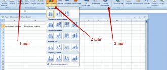
1. Select the newly created table - area G2-J7 - and click on the “Chart Wizard” icon on the Excel “Standard” toolbar - launch the wizard.
2. In the window that pops up, on the “Standard” tab, select the chart type “Bar”, type – “Stacked Bar Chart...”
3. Click on the “Next” button - on the “Data Range” tab, everything should be as in the screenshot below.
4. Click on the “Next” button again and configure the “Grid Lines” tab. We do not change anything on the remaining tabs of this window for now.
5. We proceed to the fourth and final step by clicking on the same “Next” button. Place the diagram on the same sheet and click the “Finish” button.
The template for the Gantt chart has been created.
6. Let’s remove the “Legend” from the diagram field (colored squares and the inscriptions “Days Passed” and “Days Remaining”) - right-click on the field where the “Legend” is located and select “Clear” in the drop-down window.
7. Let's set up the horizontal axis. To do this, double-click with the left mouse button on the “Value Axis”. In the “Axis Format” window that pops up, set up the “Scale”, “Font”, “Number” and “Alignment” tabs as shown in the screenshots.
The numbers limiting the time scale on the left and right are the serial numbers of days, counted from 01/01/1900.
To find out the serial number of any date, you need to enter it into a cell of the MS Excel sheet, then apply the “General” number format to this cell and read the answer.
8. Move the mouse over the “Chart area” and right-click to bring up the context menu, in which we select “Source data”. In the window that pops up, select the “Row” tab, add a new series “Stage start date” and correct the “X-axis labels”. Everything should look like in the picture.
9. Let's set up the vertical axis. Double-click on the “Category Axis” with the left mouse button. In the “Axis Format” window, set up the “Scale” tab in accordance with the image placed below.
We configure the “Font” tab in the same way as we did for the horizontal axis.
10. By double-clicking the left mouse button on any of the light yellow stripes of the “Stage start date” series, we call up the “Data series format” drop-down window. On the “Row Order” tab, move the “Stage start date” row to the very top of the list.
Now we see stripes of all data series in the chart.
11. Let’s make the stripes of the “Stage start date” row invisible.
The Gantt chart is built, all that remains is to decorate it colorfully - format it.
12. Hover your mouse over the “Chart Area” and double-click with the left button. In the “Format Chart Area” window that appears, click on the “View” tab on the “Fill Methods” button. In the “Fill Methods” window that pops up, select the “Texture” tab and select “Parchment” from it.
Close the windows by clicking on the “OK” button. The diagram area is filled with the “Parchment” texture.
13. Hover your mouse over the “Chart Construction Area” and double-click. In the “Format Construction Area” window that appears, on the “View” tab, click on the “Fill Methods” button. In the “Fill Methods” window, select the “Gradient” tab and configure it, for example, as shown below.
Close the windows with the “OK” button. The chart area is filled with the gradient you just created.
14. Change the colors of the stripes to brighter colors - green and yellow. Move the mouse pointer to the bar of the “Days Passed” row and double-click the mouse. Set up the “View” tab of the “Data Series Format” window that drops out as in the screenshot.
Similarly, change the color to yellow for the strip of the “Days left” row.
15. Finally, let's highlight the weeks on the time axis. Place the cursor on the “Main Grid Lines of the Value Axis”, double-click and in the “Format Grid Line” window set the largest line thickness.
Formatting is complete - the result is in the picture at the very top of the article and below this text.
Formulation of the problem
A company engaged in construction audit approached us with the task of automating the process of creating a work schedule in the form of a so-called Gantt chart.
The chart is used to track the progress of work, as well as monitor progress or delay behind schedule. After a short survey of employees, it turned out that almost everyone makes this graph manually, painting (and constantly repainting) the cells with color. Several people used their own templates with conditional formatting, but these were also not automated, since most of the data and formulas had to be entered manually. View of the graph before automation:
As a result of a small audit, several problems were generated.
Problem No. 1: creating a schedule header indicating the start and completion dates of work. For ease of operation, a schedule step is required, for example, a month, a third of a month. This is inconvenient to do manually, since the schedule requires reference dates, which, with such a step in the schedule, have to be set manually.
Problem #2: multi-level numbering. Due to the large number of lines and multi-level structure, a lot of manual work has to be done. The numbering should be of the form 1.1.1.1, where each subsequent number determines the serial number of the list item in the hierarchy.
Problem No. 3: arrangement of formulas. Since formulas need to be inserted depending on the level of nesting of the item, you have to arrange them and check them for the entire graph manually, while the graph can have dozens or even hundreds of lines.
Problem No. 4: convenient visual representation of inspection dates according to documents and in fact, with the ability to switch between them. In the current version, to switch between these dates you need to re-enter the date in the current date field.